Here is an attempt to raise the bar of EDA applying the art of story telling and visualization on the “Countries” data set.
Countries data set gives us insight into how countries fare w.r.t Literacy, migration, birth, death, population etc., While it looks like there might not be a lot to infer from what looks very straightforward , it was contradicting my early judgement as I dug into the data set.The first lesson we learn is not to be hypercritical about a data set.
Problem Statements
- Find out the top 10 and bottom 10 countries for all the numerical columns such as population and area
- Top 10 largest and smallest countries with respect to population and area for each continent
- Top 10 largest and smallest countries w.r.t area and population without a coastline
- How is area related to population?
- How is population related to infant mortality, literacy and GDP?
- How does GDP affect Net Migration, Infant Mortality and Literacy?
- Based on GDP, Literacy, Infant Mortality and Population Density, recommend the top 10 best countries to live in.
- Find out if there are any interesting relationships between variables
Objective of the study
Analyse the data thoroughly and come up with a few revealing insights into the data set to aid training of models in the subsequent stages of Machine Learning.
Introduction to Data Exploration
EDA is the basic structural and functional unit of data analysis just like cells are to human body .It is a good practice to understand the data first and try to gather as many insights from it as we can. Let’s imagine you’re new in town and you’ve to go to this really popular restaurant totally unheard of but recommended by your peers. Being the inquisitive self that you are the first thing you ask is “What cuisine does this restaurant specialize in?”. Added to this you might also lookup reviews on the internet. All these investigative measures you might take before dining in that restaurant is nothing but what Data scientists in their dialect call ‘Exploratory Data Analysis’. Most EDA techniques are visual in nature. EDA is one of the most important parts of Machine Learning since we just can’t build a model without inspecting the data,can we?Story telling becomes vital in EDA to know what is happening,Why it is happening,and How it is happening.
EDA for Machine Learning should be crisp and not drawn out . At the same time it must be efficient .There are innumerable plots but only a few are vital for our analysis.
Definitions and key words
Exploratory Data Analysis – Visual interpretation of data graphically concealed by a data set in the form of rows and columns.
Pandas– Python library which screens data in tabular form thus aiding analysis.
Matplotlib-Plotting library in python for visual interpretation of data graphically
Seaborn-A robust python visualization library.
Plotly Express– A powerful high level python visualization library.
Features– Column names of any particular data set.
Graphs used for our analysis
Bar Plots-It is a graphical representation of categorical data in the form of rectangular bars having lengths proportional to the values they represent.
Scatter Plots– Scatter Plots furnish visual representation of relationship between any two continuous variables.
Pie charts-Basically a circle divided into sectors representing equal or unequal statistical proportions of a whole.
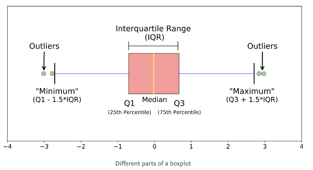
Box Plots– Graphical depiction of groups of numerical data with the help of quartiles a shown below.
Features of data set ‘countries’:
- Country-Name of the country.
- Region-Part of the world it belongs to.
- Population-Number of registered residents of a particular country.
- Population Density– Number of residents per sq. mile in of a particular country.
- Area of Country( in sq. miles)– Surface area of a particular country in sq. miles.
- Literacy (in percentage)– Percentage of literacy of a particular country.
- Infant Mortality( per 1000 infants)– Death of children under the age of one year(per 1000 infants).
- Net migration– It is the difference between the number of immigrants(people coming into a country) and emigrants(people leaving a country)
- Coastline– Coast per Area ratio.
- Phones– Number of mobile phone users per 1000 people in a particular country.
- Birthrate.
- Death rate.
- How many rows and columns do I have in the data set provided to me?
- Are the features numeric or Categorical?
Some statistical definitions
Mean:-Average of all the scores of a particular numeric data set.
Std (Standard deviation):-Average deviation of the scores from the mean of any particular column.
Variance:-Variance is average square distance of each score from the mean.
Median:-Median is the value at the midpoint among the sorted values(in ascending order).
Let’s delve right in!
Starting off, let’s have a look at our data set so that we get a rough idea about what we’re dealing with. We need to do this by importing necessary python libraries.
import pandas as pd             #  For managing datasets
import matplotlib.pyplot as plt #   For additional customization
import seaborn as sns           #  For plotting and styling
import numpy as np              # Mathematical calculation
import numpy.random as nr
import math
from matplotlib import style    # Plotting figures.
import statsmodels.api as sm
%matplotlib inline              # Plot graph directly without calling
sns.set_style('darkgrid') Loading the data
Now we read our .csv file (data) and store it in a variable called ‘countries’. This is the data frame we’ll be dealing with.Let’s take a look at the data quantitatively.
countries = pd.read_csv('Countries.csv') # Read datasetcountries.head() # Display first 5 observations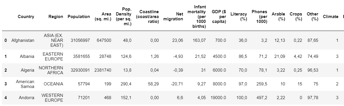
countries.shape # Displays number of rows and columns in the dataset
We have 227 rows and 20 columns. There are two types of variables continuous variables and categorical variables.
- Continuous variables are the ones that can take unlimited number of values between lowest and highest points of measurement. Columns like Area, Population are continuous variables
- Categorical variables are the variables that can be divided into multiple categories. Columns like Region, Country are categorical variables.
Now,let’s raise the following question in our mind:
- Is the data in the required form?
- For example columns such as Population Density, Area should be numeric columns
Understanding the data
Size of the data set – The data set(countries) has 227 rows and 20 Columns. Amongst 20 columns, 3 are numeric and 17 were non numeric features.
Now the column names might be little bit confounding and hence let’s rename the columns.
countries.rename(columns ={'Area (sq. mi.)':'Area','Pop. Density (per sq. mi.)':'Population density','Coastline (coast/area ratio)':'Coast_by_area','GDP ($ per capita)':'GDP_percapita','Phones (per 1000)':'Phones_per1000','Infant mortality (per 1000 births)':'Infant_morta lity_per1000'}, inplace = True) Great!
countries.dtypes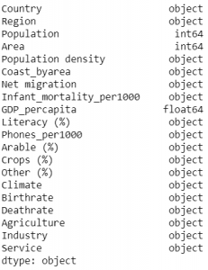
Converting the datatypes
As we see in the data set above, the features which are supposed to be of numeric datatype(ex-Population,GDP per capita etc.) are of object datatype. What are we waiting for? Let’s convert them to numeric datatype.
plot_cols2=['Net migration','Birthrate','Deathrate',
'Agriculture','Industry','Service','Population density',
'Coast_byarea','Literacy (%)','Arable (%)','Crops (%)',
'Phones_per1000','Infant_mortality_per1000','Other (%)']
for x in plot_cols2:
countries[x]=countries[x].str.split(',') # separating w.r.t ','
countries[x]=countries[x].str.join('.') countries[x]=countries[x].astype(float) # convert to floatNow that we’ve renamed the columns and converted the datatypes, let’s take a look at all the data types in our data frame.
countries.dtypes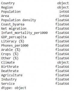
Looks like we’ve done a good job on converting the datatypes.
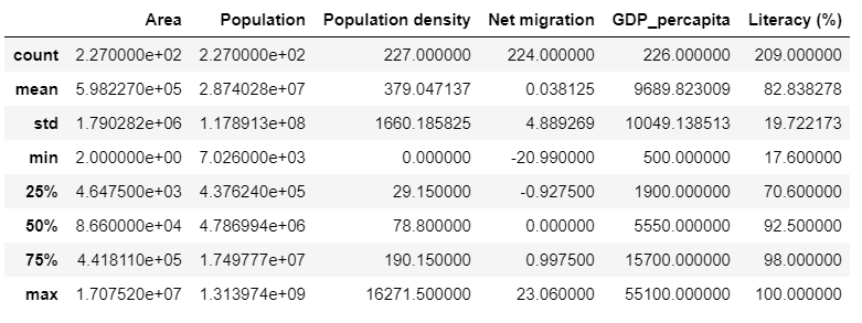
countries[['Area','Population','Population density',
           'Net migration','GDP_percapita','Literacy (%)']].describe()
Let’s take a look at some basic statistical observations from our data frame.( You might want to refer to the section containing the definitions of all the statistical terminologies)
Domain knowledge is immensely important .For example, in our current data set(countries) we have a column called ‘Region’ which is very unspecific and hence we create a new column called ‘Continent’ to group the regions accordingly.
con = {'ASIA (EX. NEAR EAST)         ':'Asia',
 'EASTERN EUROPE                     ':'Europe',
'NORTHERN AFRICA                    ':'Africa',
'LATIN AMER. & CARIB    ':'South America',
'NORTHERN AMERICA                   ':'North America',
'SUB-SAHARAN AFRICA                 ':'Africa',
'BALTICS                            ':'Asia',
'NEAR EAST                          ':'Asia',
'WESTERN EUROPE                     ':'Europe',
'C.W. OF IND. STATES ':'Asia',
'OCEANIA                            ':'Oceania'}
countries['Continent'] = [con[x] for x in countries['Region']]
countries[['Country','Region','Continent']].head()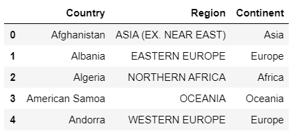
There you go! Looks much better, doesn’t it?
Let’s take a look at a pie chart of the continents. This pie chart shows the proportions of areas occupied by Continents.
labels='Asia','Africa','North America','South America','Oceania','Europe'
sizes=[112,98,70,69,57,52]
colors=['#FFE4E1',
        '#DB7093',
        '#FFB6C1',
        '#FF69B4',
        '#FF1493',
        '#EE82EE']        # 6 colours coded as hex values.
explode=(0.1,0.0,0.1,0.1,0.1,0.0)
plt.pie(sizes,explode=explode,
        labels=labels,              #Assigns labels.
        colors=colors,              #Assigns colors.
        autopct='%1.1f%%',
        shadow=True,
        startangle=90)
plt.axis('equal')
plt.title('Percentage of countries') # Set title
plt.plot()
fig=plt.gcf()
fig.set_size_inches(7,7)             # Set size of plot.
plt.show()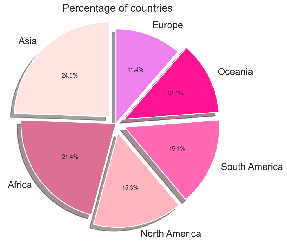
It’s pretty evident that Asia is the largest continent.
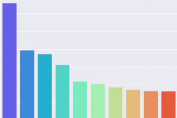
10 countries around the world with largest values of area and population.
Categorical features cannot be visualized through histograms. Instead, we can use bar plots. Bar charts are ubiquitous in the data visualization world. They present data in the simplest yet straightforward way. Let’s find the 10 countries with largest area and population by running the following code.
countries2=countries.nlargest(10,'Area') # Top 10 in area.
plt.figure(figsize=(7,5)) # Set size.
sns.barplot(y='Country',x='Area',
data=countries2,palette='rainbow') # Set palette.
countries4=countries.nlargest(10,'Population') # Top 10 in population.
plt.figure(figsize=(7,5)) # Set size.
sns.barplot(y='Country',x='Population',
data=countries4,palette='rainbow') # Set palette.
fig[1]
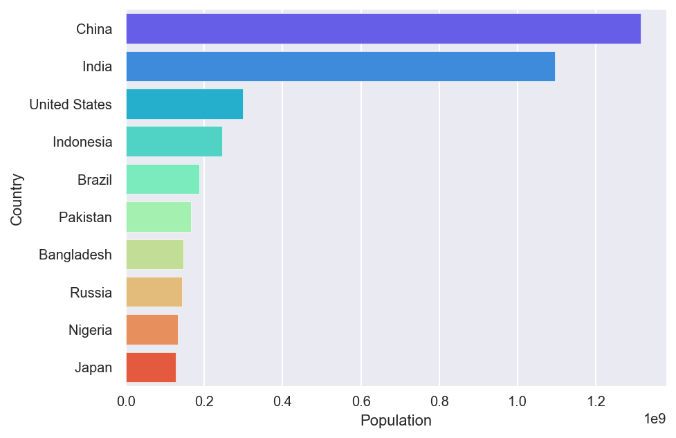
fig[2]
Let’s find the 10 countries with smallest area and population by running the following code.
countries3=countries.nsmallest(10,'Area') # Bottom 10 in area.
plt.figure(figsize=(7,5)) # Set size.
sns.barplot(y='Country',x='Area',
data=countries3,palette='rainbow') # Set palette.
countries5=countries.nsmallest(10,'Population') # Bottom 10
plt.figure(figsize=(7,5)) # Set size.
sns.barplot(y='Country',x='Population',
data=countries5,palette='rainbow') # Set palette.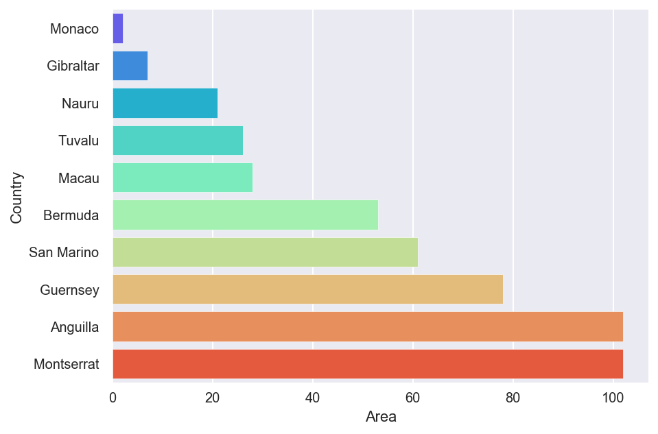
fig[3]
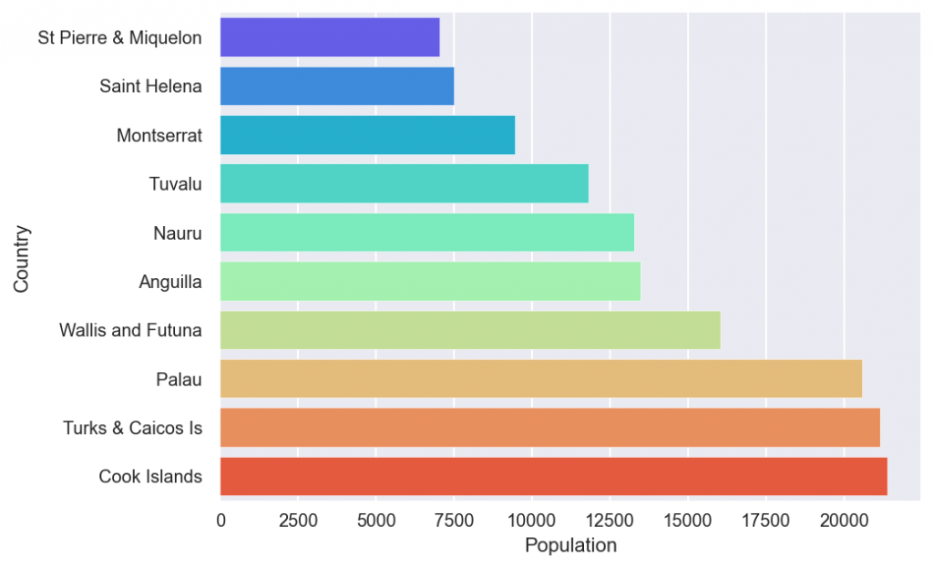
fig[4]
10 countries with largest values of GDP per capita
Let’s find the 10 countries with highest GDP per capita by running the following code.
plt.figure(figsize=(7,5))
largest_gdp=countries.nlargest(10,'GDP_percapita') # Top 10 in GDP_percapita.
sns.barplot(y='Country',x='GDP_percapita',
            data=largest_gdp,palette='rainbow')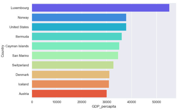
fig[5]
10 countries with largest literacy percentages
Let’s find the 10 countries with lowest literacy percentage by running the following code.
plt.figure(figsize=(7,5))
small_literacy=countries.nsmallest(10,'Literacy (%)') # Bottom 10 in literacy.
sns.barplot(y='Country',x='Literacy_percent',data=small_literacy,palette='rainbow')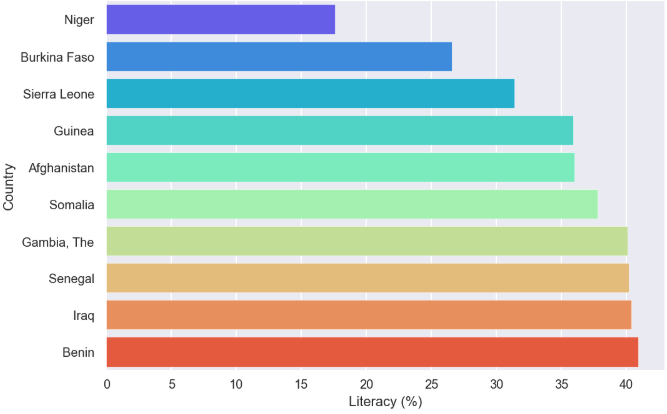
fig[6]
10 countries with largest values of infant mortality
Let’s find the 10 countries with highest infant mortality per 1000 infants by running the following code.
plt.figure(figsize=(7,5))  # Top 10 in Infant Mortality.
largest_infant_mor=countries.nlargest(10,'Infant_mortality_per1000')
sns.barplot(y='Country',x='Infant_mortality_per1000',
            data=largest_infant_mor,palette='rainbow')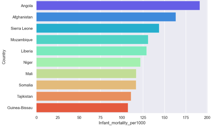
fig[7]
That’s it for Part-1 of What I Wish Everyone Knew About Exploratory Data Analysis . Let’s continue with the same data set in Part-2 where we’ll be looking at a few scatter plots analyzing the relationship between continuous variables and make the data set more insightful to aid training of models in the subsequent stages of Machine Learning.
This blog was written by Ruthu Shankar while interning at Ambee.Thanks for the read.