The Part-1 of this blog speaks of the need of EDA and some interesting bar plots pertaining to the data set ‘countries’.Click on the link above and check it out if you haven’t already. In this section we’ll mostly be dealing with continuous variables.
To find relationship between an two continuous variables using scatter plot
Scatter plots are the best to use when we need to find the relationship between two continuous variables. Now, let’s run a few scatter plots to find the relationship between any two variables in our data frame. To begin with , run the following code to find the relationship between the following variables:
- Infant mortality and Population.
- GDP per capita and Population.
- Literacy (%) and Population.
- Net migration and GDP per capita.
- Population and Area.
We are limiting the scale of x axis of the variables(Population,Area) as it aids better study.
style.use('seaborn')
y=countries.query('Population<6000000')    #limiting Population scale.
bx = sns.scatterplot(x='Population',              # Set x axis.
                     y="Infant_mortality_per1000",# Set y axis.
                     data=y,                      # Set DataFrame.
                     hue='Continent')             # Color by Continent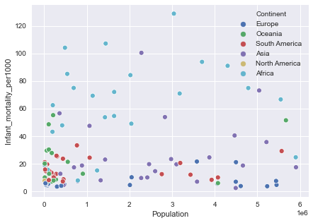
fig[8]
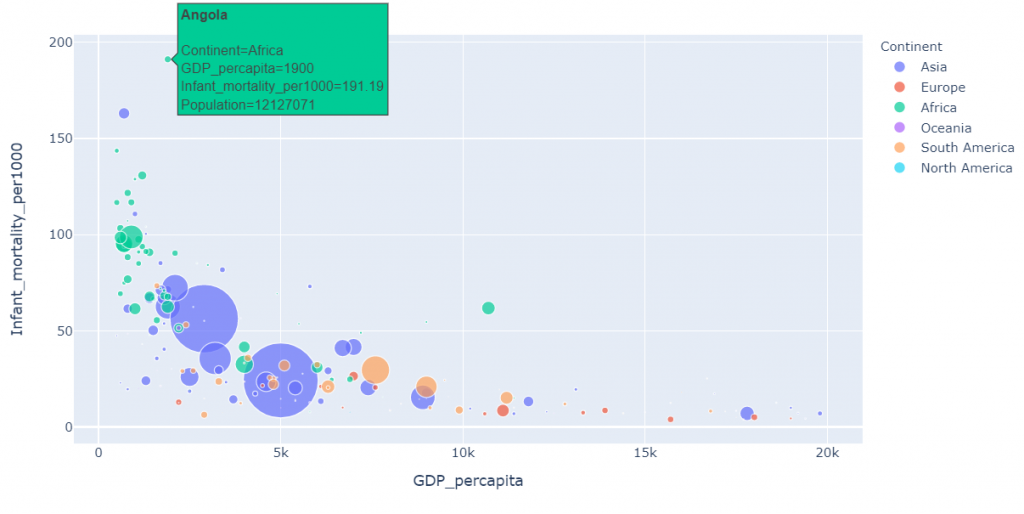
Let’s see if there is any relationship between infant mortality and GDP per capita but this time let’s make it visually appealing by running the following code:
import plotly.express as pxfig = px.scatter(
data_frame=countries[countries['GDP_percapita']<20000],
x="GDP_percapita", # x axis.
y="Infant_mortality_per1000", # y axis.
size="Population", #size of each circle.
color="Continent", #color code based on continents.
size_max=50,
#Display country name as we hover the mouse pointer
hover_name="Country",
)
fig.show()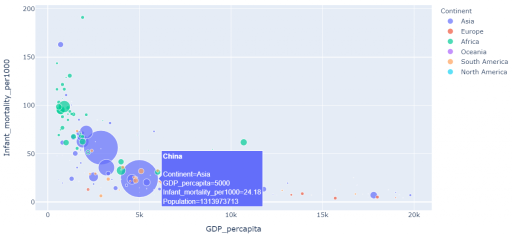
fig[9]
fig[10]
Cool right? Anyways we notice an exponential decay in the above set of graphs which means that GDP per capita increases as the Infant mortality decreases.
It is much visually appealing as well since it’s easier to analyse data with this kind of scatter plots as we get information related to a particular feature (here, Country) just by hovering the mouse pointer over it.
fig = px.scatter(
    data_frame=countries[countries['Population']<80000000],#Set scale
    x="GDP_percapita",                       # Set x axis.
    y="Population",                          # Set y axis.
    size="Population",                # Size based on population.
    color="Continent",                # Color based on Continent.
    hover_name="Country",
    size_max=30
)
fig.show()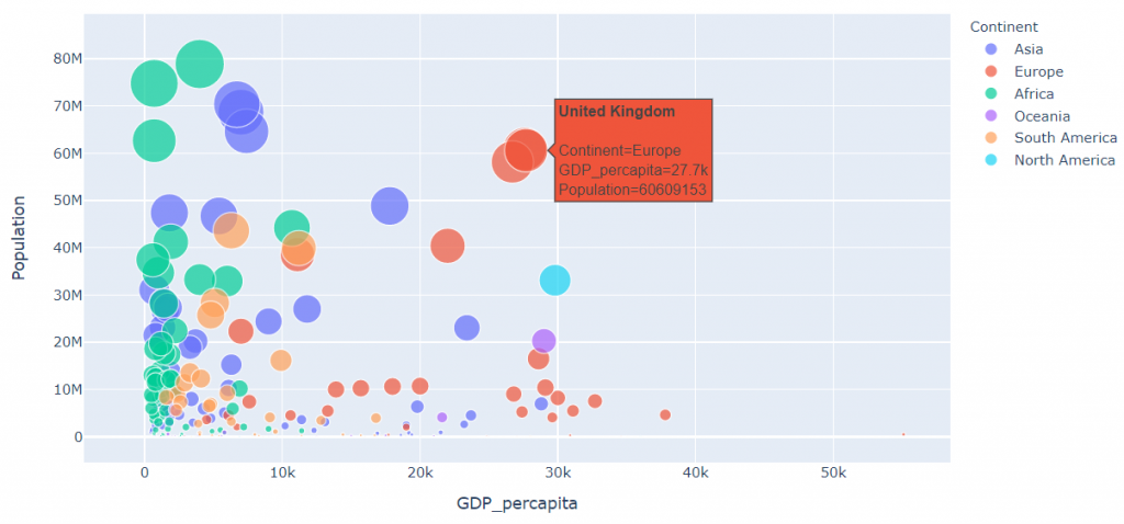
fig[11]
fig = px.scatter(
    data_frame=countries[countries['Population']<6000000],#Set scale
    x="Population",                                         # x axis
    y="Literacy (%)",                                       # y axis
    size="Population",                    # Size on population.
    color="Continent",                    # Color based on Continent.
    hover_name="Country",
    size_max=30
)
fig.show()
fig[12]
fig = px.scatter(
    data_frame=countries[countries['GDP_percapita']<30000],#Set scale.
    x="GDP_percapita",                   # x axis.
    y="Net migration",                   # y axis.
    size="GDP_percapita",                # Size on GDP_percapita.
    color="Continent",
    hover_name="Country",
    size_max=30                          #  Set max size of circle.
)
fig.show()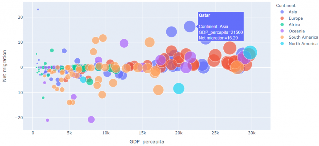
fig[13]
We see that the Net migration pretty much remains constant with respect to GDP per capita. In other words, we see a weak correlation between the two variables.
data_frame=countries[countries['Population']<120000000]
fig = px.scatter(
    data_frame=data_frame[data_frame['Area']<7000000],
    x="Population",                   # x axis
    y="Area",                         # y axis
    size="Area",
    color="Continent",
    hover_name="Country",
    size_max=30                       # Set max size of circle.
)
fig.show()
fig[14]
Box plots for certain categorical variables
( Its better to refer to the section containing the parts of a boxplot before going through this section)
Box plots are very handy as they show interquartile ranges and
Let’s look at the box plots of the following variables for further analysis by running the following code :
- GDP per capita.
- Literacy (%).
- Infant Mortality.Let’s do this by taking ‘Continent’ on the y axis .We can make box plots look better by overlapping them with swarm plots .In this example the swarm plots depict the accurate number of countries lying within any particular box plot.
pkmn_type_colors = ['#1E90FF',  # Blue
                    '#1E90FF',
                    '#F08030',  # Orange
                    '#F08030',
                    '#FF0000',  # Red
                    '#FF0000']
plt.figure(figsize=(7,5))
ax = sns.boxplot(x="GDP_percapita", y="Continent",
                data=countries,palette='Set3')   #Boxplot
sns.swarmplot(x="GDP_percapita", y="Continent",  #Swarm plot
data=countries,color='0.25',palette=pkmn_type_colors) 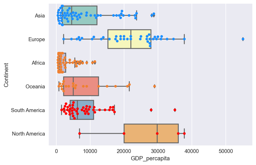
fig[15]
plt.figure(figsize=(7,5))
ax = sns.boxplot(x="Literacy (%)", y="Continent", data=countries,palette='Set3')    #Boxplot
sns.swarmplot(x="Literacy (%)", y="Continent", data=countries,color='0.25')             #Swarmplot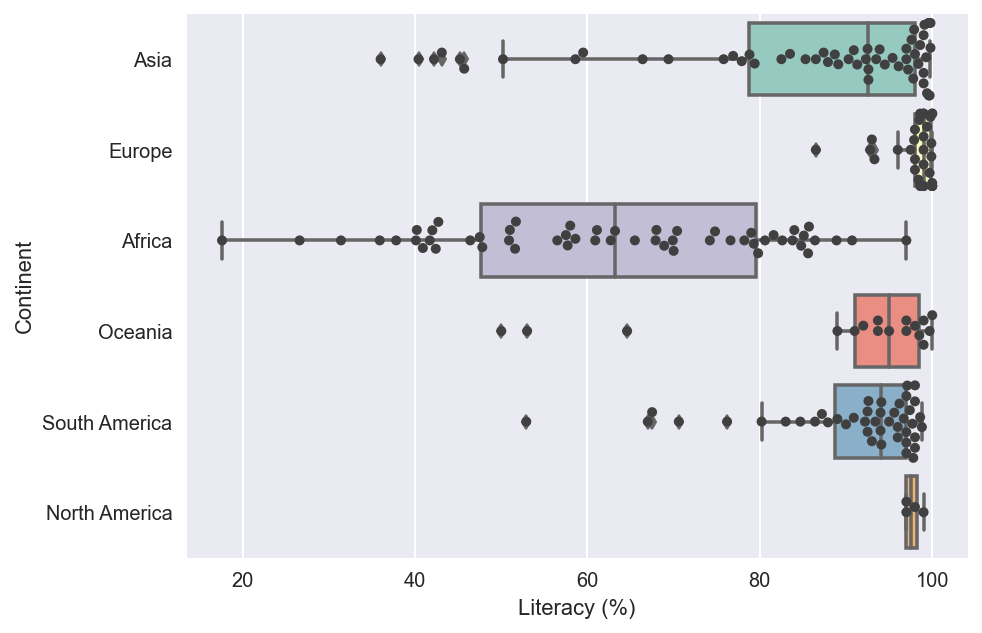
fig[16]
plt.figure(figsize=(7,5))
ax = sns.boxplot(x="Infant_mortality_per1000", y="Continent",
                data=countries,palette='Set3')  #Boxplot.
sns.swarmplot(x="Infant_mortality_per1000", y="Continent",
             data=countries,color='0.25')       #Swarmplot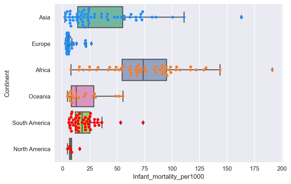
fig[17]
By knowing the number of points within each box we can find the accurate number of points lying within each quartile. In this example, each point represents a different country
10 countries without a coastline having largest and least values of area and population
Now let’s first find the countries without a coastline and among them, let’s find the 10 countries being :
- Largest in Area.
- Least in Area.
- Most populated countries.
- Least populated countries.
# Countries without coastline.
countries['Coast_byarea']= countries['Coast_byarea'].astype(object)
no_coast=countries[countries.Coast_byarea==0]
no_coast.head()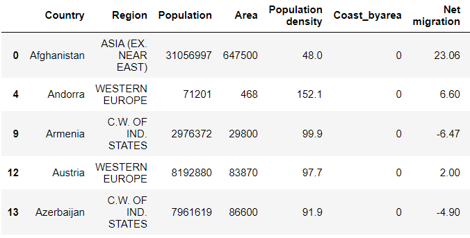
no_coast.shape
no_c_area=no_coast.nlargest(10,'Area')         # Pick largest in area.
style.use('seaborn')                               # Set style.
sns.set_style('darkgrid')                          # Set theme.
plt.figure(figsize=(7,5))                          # Set figsize
gr=sns.barplot(no_c_area['Country'],no_c_area['Area'],hue=no_c_area['Continent'],palette='muted')
gr.set_xticklabels(gr.get_xticklabels(), rotation=90)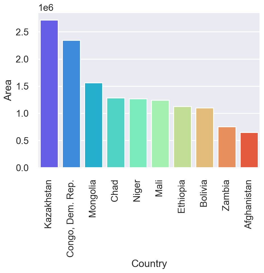
fig[18.1]
plt.figure(figsize=(7,5)) # Set figsize
no_c_area=no_coast.nsmallest(10,'Area') # Set smallest in area.
style.use('seaborn') # Set style.
gr=sns.barplot(no_c_area['Country'],no_c_area['Area'],hue=no_c_area['Continent'],palette='muted')
gr.set_xticklabels(gr.get_xticklabels(), rotation=90)
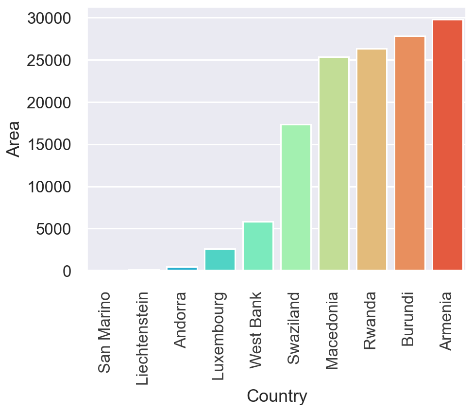
fig[18.2]
plt.figure(figsize=(7,5))                     # Set figsize
no_c_area=no_coast.nlargest(10,'Population')  # Largest in population
style.use('seaborn')                          # Set style
gr=sns.barplot(no_c_area['Country'],no_c_area['Population'],hue=no_c_area['Continent'],palette='muted')
gr.set_xticklabels(gr.get_xticklabels(), rotation=90)
fig[18.3]
no_c_pop=no_coast.nsmallest(10,'Population')#Set least in Population.
style.use('seaborn')
plt.figure(figsize=(7,5))
gr=sns.barplot(no_c_pop['Country'],no_c_pop['Population'],hue=no_c_pop['Continent'],palette='muted')
gr.set_xticklabels(gr.get_xticklabels(), rotation=90)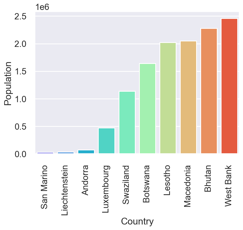
fig[18.4]
To find countries with largest and lowest values of area and population by segregating them continent wise
Now let’s pick at continent at random,say Africa and get 10 countries with:
- Largest area.
- Largest population .
- Least area.
- Least population.
a=countries.query("Continent=='Africa'")#Select African continent. lar_ar=a.nlargest(10,'Area') #Countries with largest area.
style.use('seaborn')
plt.figure(figsize=(7,5))
c = sns.barplot(lar_ar['Country'],lar_ar['Area'],palette='Set2')
c.set_xticklabels(c.get_xticklabels(), rotation=90)
fig[19.1]
lar_pop=a.nlargest(10,'Population')#Countries with largest population
plt.figure(figsize=(7,5))
c = sns.barplot(lar_pop['Country'],lar_pop['Population'],palette='Set2')
c.set_xticklabels(c.get_xticklabels(), rotation=90)
fig[19.2]
small_ar=a.nsmallest(10,'Area')         # Countries with least area.
plt.figure(figsize=(7,5))
c = sns.barplot(small_ar['Country'],
                small_ar['Area'],
                palette='Set2')          # Set color palette
c.set_xticklabels(c.get_xticklabels(), rotation=90)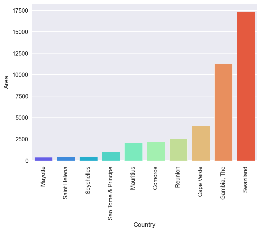
fig[19.3]
small_pop=a.nsmallest(10,'Population')# Countries with least population.
plt.figure(figsize=(7,5))
c = sns.barplot(small_pop['Country'],
                small_pop['Population'],
                palette='Set2')            # Set color palette
c.set_xticklabels(c.get_xticklabels(), rotation=90)
fig[19.4]
Similar analysis could be performed with respect to other continents too.
Let’s find the 10 best countries to live in based on Literacy (%), Infant mortality, Population density and GDP per capita.
Now for a country to be classified as a good country, GDP per capita,Literacy (%) should be high and Infant mortality, Population density should be reasonably small.
best_countries=countries.nlargest(10,['Literacy (%)','GDP_percapita'])
best_countries1=best_countries.nsmallest(10,['Population density','Infant_mortality_per1000'])
#displaying only the required columns.
best_countries1[['Country','Continent','Literacy (%)','Population density','Infant_mortality_per1000','GDP_percapita']] 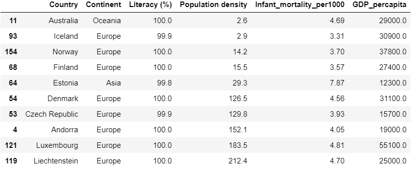
fig[20]
INFERENCE
*Russia has the largest area and China is the most populated country, Monaco has the least Area and and St. Pierre & Miquelon is the least populated country.
*Infant mortality is low mostly in countries with low population as seen in fig[8].Mean Infant Mortality is 35.5.Highest Infant mortality is in Angola(Africa) with mortality of 191.19 per 1000 infants. Over 50% of Africa has Infant Mortality between 50-100 per 1000.Least recorded Infant Mortality is 2.29 and is in Singapore. S
* 9125 is the average GDP per capita. Luxembourg(Europe) has the highest GDP per capita of 55100.Least GDP per capita is recorded by Asia(500) in the country East Timor. From the box plots as seen in fig[15] we can see that Over 75% North America and Europe have above average GDP per capita .Over 50% of Asia,South America,Oceania have below average GDP per capita. Almost 100% of Africa has GDP below average .Majority of the countries with low population have GDP per capita falling below average as seen in fig[11].
*When it comes to literacy,The average literacy is found to be 82% and every country of Europe has above average literacy as seen in fig[16].Niger(Africa) has the least Literacy 17.6% followed by Burkina Faso, Sierra Leone, Guinea(Africa).In Asia, Afghanistan,Iraq have the least Literacy percentage being less than 40%.All countries of North America have literacy over 90%(above average). All the above observations can be made from fig[16]. Countries like Andorra, Denmark,Finland,Liechtenstein,Luxembourg,Norway, Czech Republic ,Iceland,Estonia(Europe) have 100% Literacy and less population as seen in fig[20].
*The Infant mortality exponentially reduces as GDP increases as seen in fig[9] and fig[10].Adding this to the previous point we may say that Infant mortality is dependent on the Literacy percentage of a country .
*Net migration remains pretty much constant as GDP increases as seen in fig[13].
*From fig[20] we obtain the top 10 countries to reside in based on various factors like Literacy percentage, GDP per capita,Population Density and Infant mortality.
Conclusion drawn is that the countries that have high literacy percentage tend to be far ahead of other countries which in turn increases the GDP as the number of educated people increases and hence tends to offer better lifestyle for its citizens.
Data science is an important subset of Computer Science engineering .Now that we have performed EDA on the given data set successfully and satisfactorily, We have gained some valuable insights that we can use in further analysis as we proceed to training the data using multivariate linear regression.
The EDA was performed by Ruthu Shankar while interning at Ambee.
Thanks for the read 🙂