Ever wondered how to plot data on a map using python? We are going to find out in today’s tutorial.
We are going to plot what’s called a choropleth map. A choropleth map is a type of thematic map in which areas are shaded or patterned in proportion to a statistical variable that represents an aggregate summary of a geographic characteristic within each area, such as population density or per-capita income. [Source: Wikipedia]
We need the following libraries installed .
- descartes
- matplotlib
- pandas
- geopandas
Descartes and Matplotlib are used by Geopandas’ plot function to generate geographical plots.
Pandas is required for importing, manipulating and merging the data.
Geopandas is a library built on pandas to handle geospatial data as a dataframe. geopandas can plot multiple types of geospatial maps and we are going to take a look at choropleth maps which are one of the most popular types of maps.
First, let us import the required libraries.
!pip install descartes
import pandas as pd
import geopandas as gpd
import matplotlib.pyplot as plt
from matplotlib import style
Now, let us read the data which we want to plot.
country=pd.read_csv('country.csv')geopandas has some pre-built datasets available, we can see a list of them using gpd.datasets.available. We are going to use the ‘naturalearth_lowres’ dataset which contains the shape of all countries in the world. Let us load the data.
world = gpd.read_file(gpd.datasets.get_path('naturalearth_lowres'))Now, let us plot the contents of the world geopandas DataFrame.
world.plot(figsize=(20,20))
We can see that we have a world map with shapes of all the countries.
Now, let us plot the CO2 Emissions per capita data onto this map. We will use the CO2 data present in the country DataFrame.
co2=country[['country',
'CO2 emission estimates (million tons/tons per capita)']]
We will now merge the data to the world GeoDataFrame.
world=world.merge(co2,left_on='name',right_on='country',how='outer')We can plot the choropleth map of CO2 Emissions per capita using the following code.
world.plot(column='CO2 emission estimates (million tons/tons per capita)', figsize=(20,20))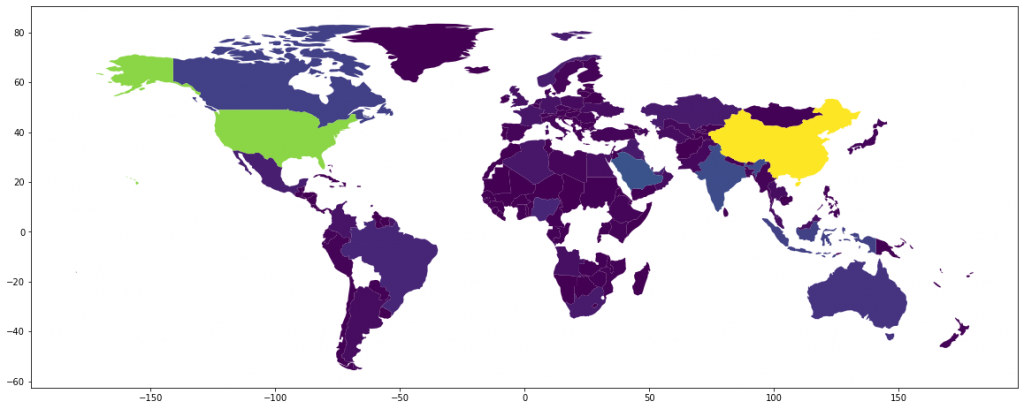
We can add legend to the map to make it more useful.
world.plot(column='CO2 emission estimates (million tons/tons per capita)',figsize=(20,10),legend=True,legend_kwds={'label': "CO2 Emission Per Capita",'orientation': "horizontal"})
We can see that some countries are missing, It’d be better if we can represent the countries without data with grey. We can do that using the following code.
world.plot(column='CO2 emission estimates (million tons/tons per capita)',figsize=(20,10),legend=True,legend_kwds={'label': "CO2 Emission Per Capita",'orientation':"horizontal"},missing_kwds={'color': 'lightgrey'})
The borders of countries are not clearly defined. We can add a boundary basemap to fix this. We will also use a better color-scheme. There are two examples shown below.
base=world.boundary.plot(figsize=(20,10),edgecolor='black')
world.plot(ax=base,column='CO2 emission estimates (million tons/tons per capita)',figsize=(20,10),legend=True,legend_kwds={'label': "CO2 Emission Per Capita",'orientation':"horizontal"},missing_kwds={'color': 'lightgrey'},cmap='RdYlGn_r')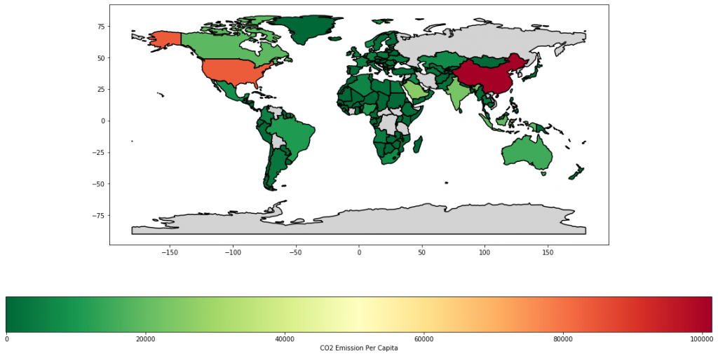
base=world.boundary.plot(figsize=(20,10),edgecolor='black')
world.plot(ax=base,column='CO2 emission estimates (million tons/tons per capita)',figsize=(20,10),legend=True,legend_kwds={'label': "CO2 Emission Per Capita",'orientation':"horizontal"},missing_kwds={'color': 'lightgrey'},cmap='copper_r')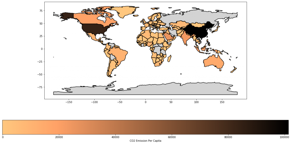
But what if you want to plot geographical data for a country or state or district instead of the world? We can use the same method. However, we need a shapefile for the region. Fortunately we can find shapefiles for most regions online.
We will now plot a choropleth map for US Population.
We will read the data from a zip file and load it to a GeoDataFrame. Please note that the zip file should contain shapefile.
zipfile='zip:///home/paree/Downloads/states_21basic.zip'
custom=gpd.read_file(zipfile)
We will now plot our shapefile.
custom.plot(figsize=(20,10))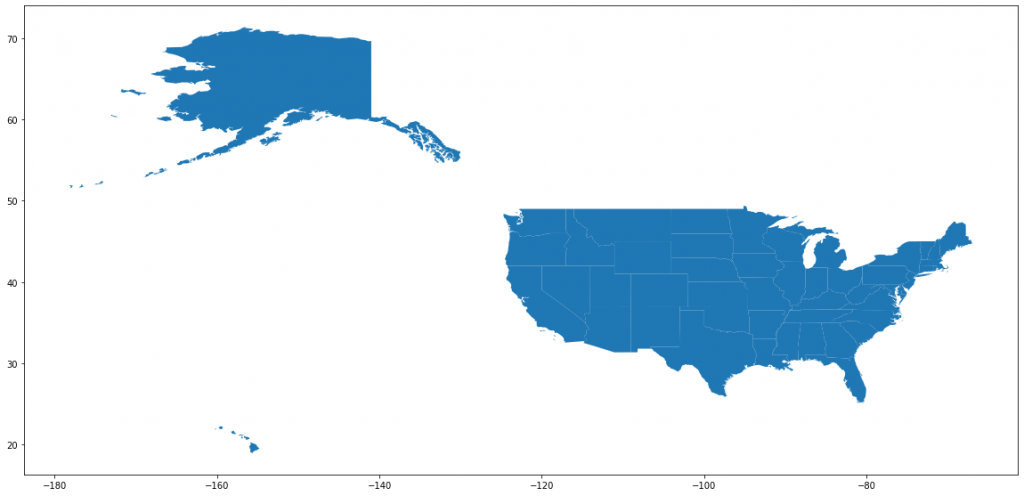
Let us read the population data.
us=pd.read_csv('uspop.csv')Now, let us merge this with the GeoDataFrame.
custom=custom.merge(us,left_on='STATE_NAME',right_on='State',how='outer')Let us plot the data.
base=custom.boundary.plot(figsize=(20,10),edgecolor='black')
custom.plot(ax=base,column='2018 Population',
figsize=(20,10),legend=True,legend_kwds={'label': "2018 Population",
'orientation': "horizontal"},missing_kwds={'color': 'lightgrey'},cmap='Blues')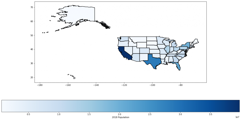
We might want to remove Alaska and Hawaii from the map to get a better look at other states.
custom=custom[custom['STATE_NAME']!='Alaska']
custom=custom[custom['STATE_NAME']!='Hawaii']
base=custom.boundary.plot(figsize=(20,10),edgecolor='black')
custom.plot(ax=base,column='2018 Population',figsize=(20,10),legend=True,legend_kwds={'label': "2018 Population",'orientation':"horizontal"},missing_kwds={'color': 'lightgrey'},cmap='Blues')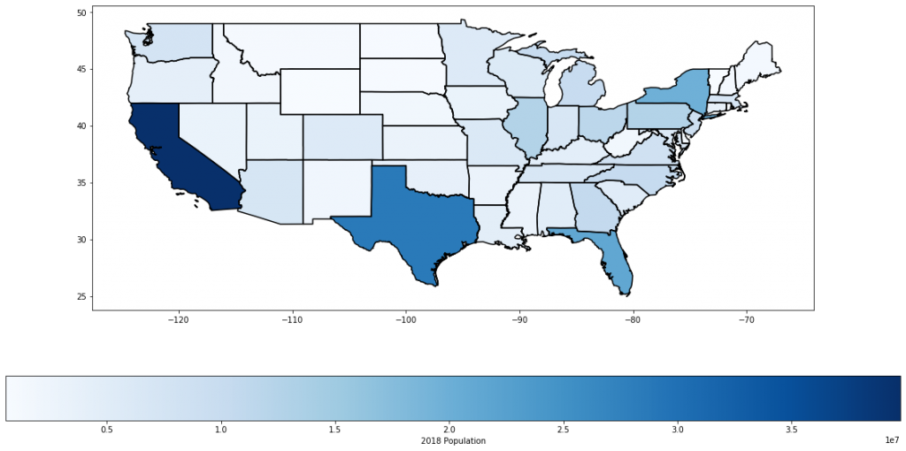
And, we are done with the tutorial. I hope this was helpful and happy plotting.