Data Visualization is about taking data and representing it visually to make large data interpretable to humans. Data Visualization also allows us to look at trends and patterns in the data to facilitate decision making.
Python has a lot of data visualization libraries for common type of visualizations. Some of the major libraries are:
- matplotlib
- seaborn
- plotly
- bokeh
In this tutorial, we will be using matplotlib and seaborn and looking at common types of plots. We will also be looking at easy ways to make graphs prettier.
Common Types of Charts
- Bar Plot – A bar chart or bar graph is a chart or graph that presents categorical data with rectangular bars with heights or lengths proportional to the values that they represent. The bars can be plotted vertically or horizontally. A vertical bar chart is sometimes called a column chart.
- Line Plot – A line chart or line plot or line graph or curve chart is a type of chart which displays information as a series of data points called ‘markers’ connected by straight line segments.It is a basic type of chart common in many fields.
- Pie Chart – A pie chart (or a circle chart) is a circular statistical graphic, which is divided into slices to illustrate numerical proportion. In a pie chart, the arc length of each slice (and consequently its central angle and area), is proportional to the quantity it represents.
- Box Plot – A box plot is a method for graphically depicting groups of numerical data through their quartiles. Box plots may also have lines extending from the boxes (whiskers) indicating variability outside the upper and lower quartiles, hence the terms box-and-whisker plot and box-and-whisker diagram. Outliers may be plotted as individual points.
- Scatter Plot – A scatter plot is a type of plot used to visualize relationship between two variables. The data are displayed as a collection of points, each having the value of one variable determining the position on the horizontal axis and the value of the other variable determining the position on the vertical axis.
- Histogram – A histogram is an approximate representation of the distribution of numerical or categorical data. A histogram can be a line histogram or a bar histogram.
Using Matplotlib
Matplotlib has 3 different layers, each layer has different level of customization.
Different layers of matplotlib are:
- Scripting Layer
- Artist Layer
- Backend Layer
We will be looking at the scripting layer since its the most easy to use. Scripting layer can be used using matplotlib.pyplot.
Importing the Libraries
Lets start by importing the libraries. We’ll import pandas for reading the data and matplotlib for plotting.
import pandas as pd
import matplotlib.pyplot as plt
from matplotlib import style
Importing the Data
We are going to use two datasets, just for demonstrating the things we can do with matplotlib and seaborn.
df=pd.read_csv("iris.csv")
df1=pd.read_csv("India GDP from 1961 to 2017.csv")
Basic Usage of pyplot
If you want to plot something quickly, you can use pyplot.plot function. If you pass a single column it’ll plot it against the index. If you pass two columns, you’ll get a line graph by default and a scatter plot if you pass the string ‘o’. We can also change the color of the data points being plotted by passing two character strings like ‘ro’. We can also use different markers such as ‘+’.
plt.plot(df['sepal_length'])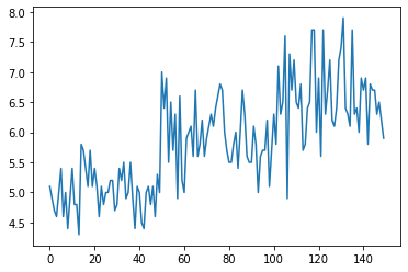
plt.plot(df['sepal_length'],'o')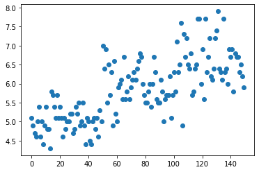
plt.plot(df['sepal_length'],'ro')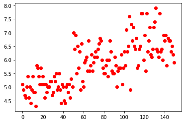
plt.plot(df['sepal_length'],'b+')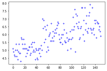
Setting Style
You might have noticed that our plots do not look visually pleasing. One easy trick to make it instantly look better is to use matplotlib.style. It comes with a large amount of styles, so feel free to experiment. In this tutorial, we are going to use the style ‘ggplot’ which is based on the famous R library ggplot2.
We can use style.available to get a list of all the styles.
style.available['fast',
'seaborn-white',
'fivethirtyeight',
'seaborn-notebook',
'Solarize_Light2',
'seaborn-deep',
'_classic_test',
'dark_background',
'seaborn-ticks',
'seaborn-dark',
'grayscale',
'classic',
'seaborn-whitegrid',
'seaborn-dark-palette',
'seaborn-bright',
'tableau-colorblind10',
'seaborn-paper',
'seaborn-pastel',
'seaborn-colorblind',
'bmh',
'seaborn-poster',
'seaborn-talk',
'ggplot',
'seaborn-muted',
'seaborn-darkgrid',
'seaborn']Now, let us set style by using style.use(). We’ll use ‘ggplot’ as argument.
style.use('ggplot')
plt.plot(df['sepal_length'])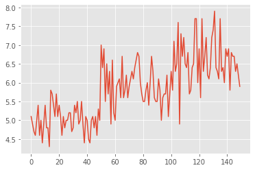
We can notice that our plot looks instantly better.
Plotting Basic Plots in Matplotlib
Scatter Plot
Scatter plot can be generated by using plt.scatter() and passing two arguments for x and y.
plt.scatter(df['sepal_length'],df['sepal_width'])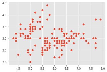
Now, lets look at coloring the data points by their species. To do this, we need more than a single line of code. Lets see how we can do it. First, we need to create groups using pandas and we can plot the scatter plot using a for loop. We shall also go ahead and add labels for x and y axis and add a title. We can do this by using xlabel, ylabel and title methods in pyplot.
groups=df.groupby('species')
for name, group in groups:
    plt.scatter(group['sepal_length'],group['sepal_width'])
plt.legend(df['species'].unique())
plt.xlabel('Sepal Length')
plt.ylabel('Sepal Width')
plt.title('Sepal Length VS Sepal Width')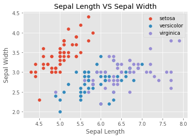
Bar Plot
We can plot a bar plot by using plt.bar() and passing x and y values. x-axis generally contains categorical value and y contains a numerical value.
plt.bar(df['species'],df['petal_length']) 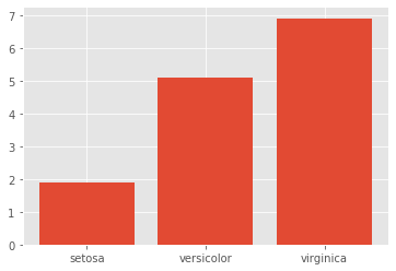
Pie Chart
Plotting a pie chart in matplotlib is relatively easy. First, let us extract the counts for the species column and then plot it using matplotlib. We shall add the legend as well and set its position using bbox_to_anchor parameter.
plt.pie(df['species'].value_counts())
plt.legend(df['species'].unique(),bbox_to_anchor=(0.00, 1))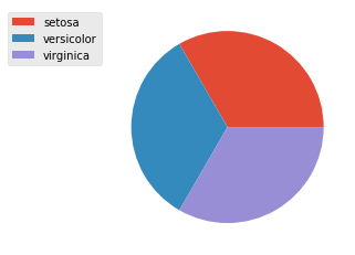
Line Plot
Line plots are pretty easy in matplotlib. We can use plt.plot to generate it. We shall visualize India’s GDP percentage from 1960-2017
plt.plot(df1['Year'],df1['GDP'])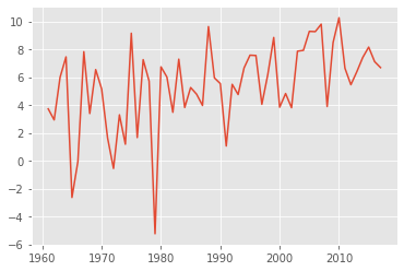
Histogram
We can generate histogram using plt.hist() method and pass a numerical column as parameter, we can also set the number of bins and play with a few style options.
plt.hist(df1['GDP'])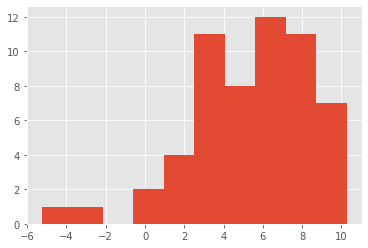
Box Plot
We can generate boxplot by using plt.boxplot(). However, if we want to group the boxplot by species like we did with scatter, we can use panda’s implementation of boxplot using df.boxplot() instead since its pretty straight forward.
plt.boxplot(df['sepal_length'])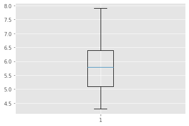
df.boxplot(column='sepal_length',by='species',figsize=(7,7))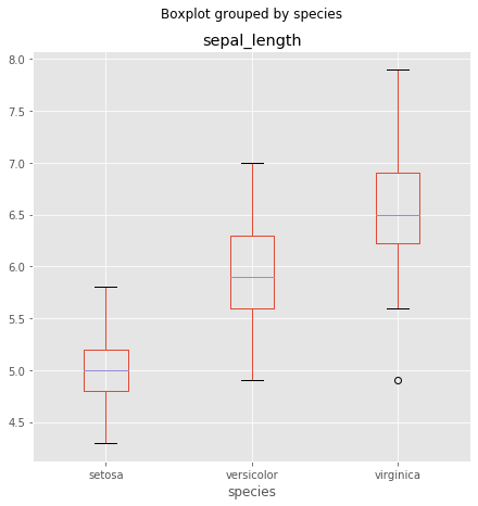
Using Seaborn
Seaborn is a plotting library build on top of matplotlib. It provides an easy way to produce good looking plots. Since it is built upon matplotlib, both can be used together to enhance plots generated by the other. We will be looking at few examples for using seaborn to enhance matplotlib plots.
Setting Aesthetics
Lets start by using seaborn’s aesthetics methods to style matplotlib plots. We generally use the alias ‘sns’ for seaborn.
sns.set() will set seaborn styling to matplotlib plots.
import seaborn as sns
sns.set()
plt.plot(df1['Year'],df1['GDP'])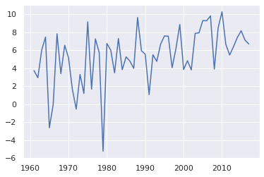
sns.set_style() can be used to set the grid style. The following example shows how to use it.
sns.set_style('dark')
plt.plot(df1['Year'],df1['GDP'])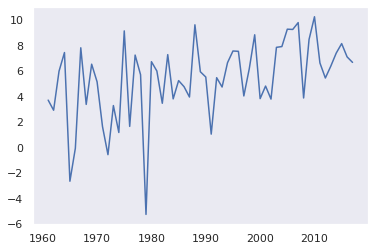
sns.set_palette() can be used select color palettes. Seaborn has some built in palettes but built in or custom palettes can also be used. We will be looking into it later in the tutorial.
sns.set_palette(sns.light_palette("navy", reverse=True))
sns.set_style('darkgrid')
plt.plot(df1['Year'],df1['GDP'])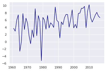
Plotting Basic Plots in Seaborn
Now, lets look at how to plot different types of charts in seaborn. We will be looking at the same types of charts that we looked at when we were using matplotlib.
Scatter Plot
Scatter Plot can be generated using sns.scatterplot(). We can also group data points to categories just by passing the hue parameter with the column containing categorical values.
style.use('seaborn')
sns.scatterplot(df['sepal_length'],df['sepal_width'],hue=df['species'])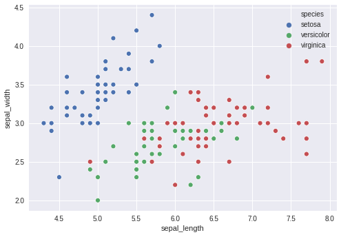
Let us create a custom palette and use it. It is as simple as creating a list of colors in hexadecimal values.
pal=['#7C1E2E','#202B33',"#187878"]
style.use('seaborn')
sns.set_palette(pal)
sns.scatterplot(df['sepal_length'],df['sepal_width'],hue=df['species'])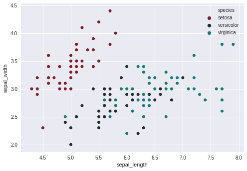
Now, let us alter the scatter plot and add a fourth variable which we will represent using ‘size’ parameter. The resulting plot is called a bubble chart.
pal=['#7C1E2E','#202B33',"#187878"]
style.use('seaborn')
plt.figure(figsize=(15,10))
sns.set_palette(pal)
sns.scatterplot(df['sepal_length'],df['sepal_width'],hue=df['species'],size=df['petal_length'])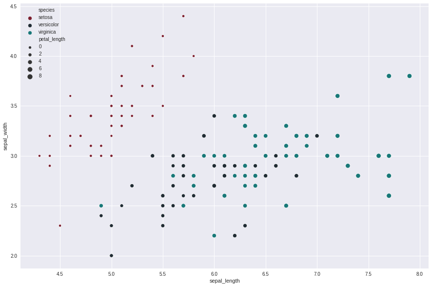
Bar Plot
Bar plot can be generated using sns.barplot and passing x and y values.
sns.barplot(df['species'],df['petal_length'])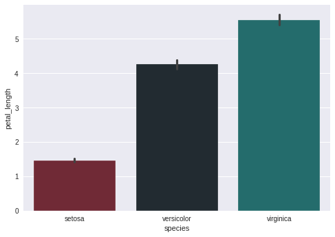
seaborn also provides countplot method from which you can see the counts of a categorical column.
sns.countplot(df['species'])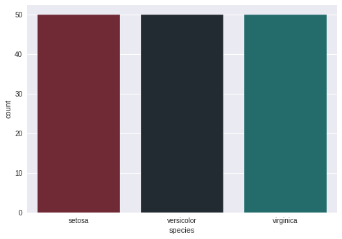
Box Plots
Box plot can be generated using sns.boxplot() method. Passing a single column will generate a single box plot. Passing the categorical variable with the column will group the values by the categorical variable values. We can pass it in any order and it’ll only result in horizontal and vertical alignment differences.
sns.boxplot(df['species'],df['petal_length'])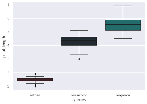
Histogram
Histogram can be generated using sns.distplot(). Seaborn provides both bar histogram and line histograms by default.
sns.distplot(df1['GDP'])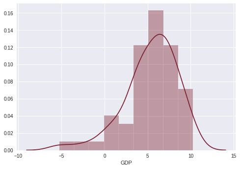
Line Plot
Line plot can be generated using sns.lineplot and passing x and y values. As simple as that.
sns.lineplot(df1['Year'],df1['GDP'])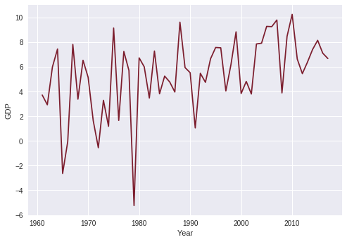
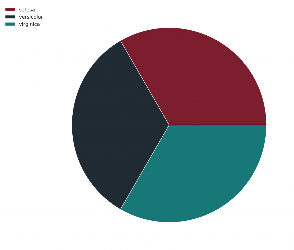
Pie Chart
Unfortunately, seaborn does not support pie charts. But, we can still use seaborn’s styling to generate pie charts using matplotlib.
pal=['#7C1E2E','#202B33',"#187878"]
sns.set_palette(pal)
plt.figure(figsize=(10,10))
plt.pie(df['species'].value_counts())
plt.legend(df['species'].unique(),bbox_to_anchor=(0.00, 1))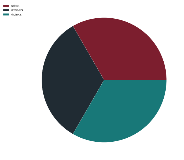
Using Palettable
A good selection of colors can really enhance data visualization experience. Although both matplotlib and seaborn come with built in styling and palettes and we can always use custom palettes, it is really handy to have a wide selection of existing palettes available. Enter palettable. It is a library which contains a wide variety of palettes from different data visualization tools and libraries that can be used alongside with matplotlib and seaborn. Let us see how we can use it.
We will be using one of my favorite palettes called Prism. Here are a few examples:
from palettable.cartocolors.qualitative import Prism_10
sns.set()
sns.set_palette(Prism_10.mpl_colors)
sns.scatterplot(df['sepal_length'],df['sepal_width'],hue=df['species'])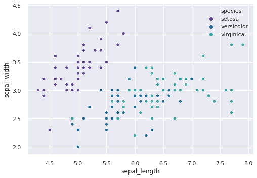
sns.barplot(df1['Year'].tail(10),df1['GDP'].tail(10))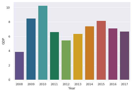
There are multiple palettes available in palettable so feel free to mess around.
Saving Plots in High Resolution
We can save the generated graphs in high resolution using plt.savefig() method. We can set the figure size and dpi using plt.figure(). If we want a transparent background, we can use transparent=True in savefig() method.
pal=['#7C1E2E','#202B33',"#187878"]
sns.set_palette(pal)
plt.figure(figsize=(10,10),dpi=400)
plt.pie(df['species'].value_counts())
plt.legend(df['species'].unique(),bbox_to_anchor=(0.00, 1))
plt.savefig('a.png',transparent=True)